 Persona Help Center
What is the Inquiry Container component?
Container is an Inquiry screen component that adds a layout element used to group and organize other components to the screen. You can customize its appearance and define logic that governs when it appears.
A Container component helps structure content by controlling alignment, spacing and styling. Containers can be used to manage the overall layout of a screen.
How do you add an Inquiry Container component?
- Navigate to the Dashboard, and click on Inquiries > Templates.
- Find and click on the Inquiry template you want to edit, or Create a new template.
- Hover over a screen and click the Pencil icon, or double-click the screen to open it in the Screen Editing View.

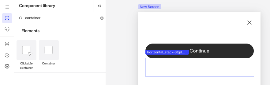
- In the Left Panel, click Component Library and search for ‘Container’.
- Drag and drop the Container component into your screen, and reposition it by dragging it around.
- To customize the Container component you can drag and drop any component. For example, if you want to add important links you can drag and drop a Text component into the Container.
- (Optional) In the Styles tab, you can edit the Container’s sizing, spacing, layout, color and border. You can read more about Styles below.
- (Optional) In the Logic tab, you can add rules that govern when the component appears, and when it does not. You can read more about Logic below.
- Close the step. You’ll have to Save and Publish the template to begin using it.
Styles
You can customize how your component appears to users in the Styles tab, modifying elements like sizing, spacing, layout, color, and border to align with your branding and enhance usability.
Sizing
Container size can be defined by adjusting its width. Under Resizing, select Fixed Width to set a custom size, this is the default selection. Or choose Fill Width to make the container fill the screen.
Spacing
Margins can be adjusted on all four sides of the Container component (top, left, bottom, right) to control the spacing between it and other elements on the screen. For instance, increasing the top margin can create more breathing room above the Container component, while adjusting the bottom margin can ensure consistent spacing with subsequent elements, reinforcing a clean and organized layout.
Padding can be adjusted on all four sides of the Container component (top, left, bottom, right) to control the spacing between it and the edge of the screen. Increasing padding creates more space inside the Container, ensuring its content doesn’t feel cramped and aligns neatly with the overall design.
Layout
The alignment options allow for control over the positioning of elements inside the Container, offering vertical alignment choices (left, center, right) and a horizontal alignment (top, center, bottom). Adjust the spacing between items in the Container by increasing or decreasing the Spacing.
Use Frame positioning to control the width of the Container with respect to the screen. Edge-to-edge sets the Container component to span the entire screen, while inside margins sets the width with respect to the screen margins.
Colors
Setting a background color allows you to customize the visual appearance of the Container, providing contrast and enhancing the overall design.
Border
You can add a border to all four sides of the Container component (top, left, bottom, right) for custom styling. Adding a border radius creates rounded edges, which softens the Container’s appearance for a more modern look. You can also customize the border's color to match your design.
Logic
Persona provides you with the ability to add logic to a Container component. For example, a component may only become visible to a user if certain conditions are met. There are two options for logic rules:
- On screen load: Logic rules are evaluated only when the screen loads. They can reference any field configured on the template.
- On screen update: Logic rules are evaluated in real time. They can only reference inputs on the current screen.

Logic Rules
Logic rules consist of three main components:
- Field: The object that will have a condition linked to it.
- Condition: How the field is compared to the value (e.g., equals, does not equal).
- Value: The value to test against.
Creating Logic Rules
- AND Statements: Combine multiple conditions that must all be true for the rule to pass. Add these using the "Add" button.
- OR Groups: Combine conditions where only one needs to be true for the rule to pass. Create these by clicking "Add OR Group".
How to use Logic Rules
- Click on the Container component, and go to Logic in the Right Panel.
- Choose either “On screen load” or “On screen update” and click Add.
- Choose what Component Update to apply. This determines what happens to the component when the logical rules are met.
- Create a logical rule by filling in the three boxes following When, which correspond to an object, its condition, and its value being assessed, respectively. When that logical rule passes, the component update is applied.
- (Optional) Add additional logical rules by clicking either + Add (if you want to add 'AND' rules, where all must be passed to continue) or + Or (if you want to add 'OR' rules, where one must be passed to continue). You can also nest a group of OR statements within an AND statement by clicking + Add Group.
- (Optional) To edit the logic directly, you can open the code editor.
Plans Explained
Container component by plan
| Startup Program | Essential Plan | Growth Plan | Enterprise Plan | |
|---|---|---|---|---|
| Container component | Available | Available | Available | Available |
| Styles for Container component | Available | Available | Available | Available |
| Logic for Container component | Not Available | Not Available | Available as part of Inquiries Enhanced | Available as part of Inquiries Enhanced |