 Persona Help Center
What is the Inquiry Image component?
An Image component is an Inquiry screen component that adds an image to the screen. You can customize its appearance and define logic that governs when it appears.
Adding an image to a screen is useful for enhancing visual appeal, supporting branding, or providing content. Examples include displaying a logo at the top of the screen or adding an illustration to guide users through a process. Images help capture attention and make the interface more engaging and informative.
How do you add an Inquiry Image component?
- Navigate to the Dashboard, and click on Inquiries > Templates.
- Find and click on the Inquiry template you want to edit, or Create a new template.
- Hover over a screen and click the Pencil icon, or double-click the screen to open it in the Screen Editing View.

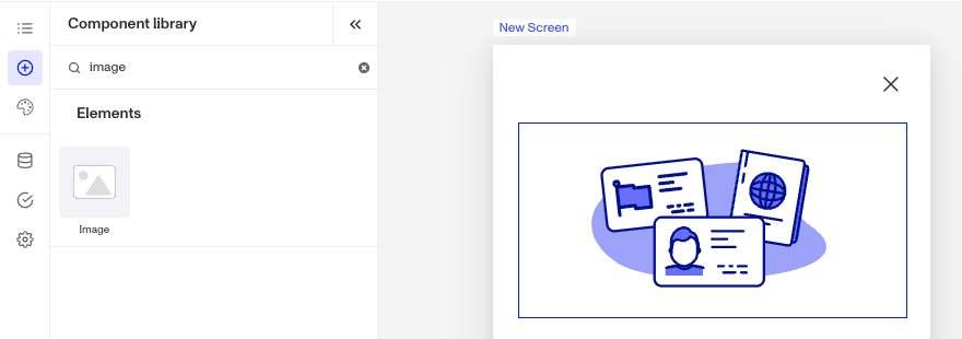
- In the Left Panel, click Component Library and search for ‘Image’.
- Drag and drop the Image component into your screen, and reposition it by dragging it around.
- Click on the Image component, and go to Properties in the Right Panel. To upload an image:
- Click the Replace button. Under My assets, click Add new to upload your own image. Alternatively, select Persona assets to browse through Persona's provided image library.
- Alt text can be added to uploaded images. Alt text improves accessibility by describing an image for users who rely on screen readers and provides context if the image fails to load. It ensures all users can understand the content and purpose of the image.


- (Optional) In the Styles tab, you can edit the image’s sizing, spacing, layout, colors. You can read more about Styles below.
- (Optional) In the Logic tab, you can add rules that govern when the component appears, and when it does not. You can read more about Logic below.
- Close the step. You’ll have to Save and Publish the template to begin using it.
Styles
You can customize how your component appears to users in the Styles tab, modifying elements like image sizing, spacing, layout, colors.
Sizing
Image size can be defined by adjusting its height or width. Under Resizing, choose either Fill Height or Fill Width to make the image fill the screen, this is the default selection. Or select Fixed Height or Fixed Width to set a custom size. The image will always maintain its original proportions and won't become distorted when resized.
Spacing
Margins can be adjusted on all four sides of the Image component (top, left, bottom, right) to control the spacing between it and other elements on the screen.
Layout
The alignment options allow for control over the positioning of elements, offering horizontal alignment choices (left, center, right).
Colors
For images included in the Persona assets, you can customize various color properties including fill color, background color, highlight color, and stroke color. Note that available color options may vary depending on the specific image. Feel free to experiment with colors to achieve your desired design.
Logic
Persona provides you with the ability to add logic to an Image component. For example, a component may only become visible to a user if certain conditions are met. There are two options for logic rules:
- On screen load: Logic rules are evaluated only when the screen loads. They can reference any field configured on the template.
- On screen update: Logic rules are evaluated in real time. They can only reference inputs on the current screen.

Logic Rules
Logic rules consist of three main components:
- Field: The object that will have a condition linked to it.
- Condition: How the field is compared to the value (e.g., equals, does not equal).
- Value: The value to test against.
Creating Logic Rules
- AND Statements: Combine multiple conditions that must all be true for the rule to pass. Add these using the "Add" button.
- OR Groups: Combine conditions where only one needs to be true for the rule to pass. Create these by clicking "Add OR Group".
How to use Logic Rules
- Click on the Image component, and go to Logic in the Right Panel.
- Choose either “On screen load” or “On screen update” and click Add.
- Choose what Component Update to apply. This determines what happens to the component when the logical rules are met.
- Create a logical rule by filling in the three boxes following When, which correspond to an object, its condition, and its value being assessed, respectively. When that logical rule passes, the component update is applied.
- (Optional) Add additional logical rules by clicking either + Add (if you want to add 'AND' rules, where all must be passed to continue) or + Or (if you want to add 'OR' rules, where one must be passed to continue). You can also nest a group of OR statements within an AND statement by clicking + Add Group.
- (Optional) To edit the logic directly, you can open the code editor.
Plans Explained
Image component by plan
| Startup Program | Essential Plan | Growth Plan | Enterprise Plan | |
|---|---|---|---|---|
| Image component | Available | Available | Available | Available |
| Styles for Image component | Available | Available | Available | Available |
| Logic for Image component | Not Available | Not Available | Available as part of Inquiries Enhanced | Available as part of Inquiries Enhanced |
Learn more about pricing and plans.