 Persona Help Center
Overview
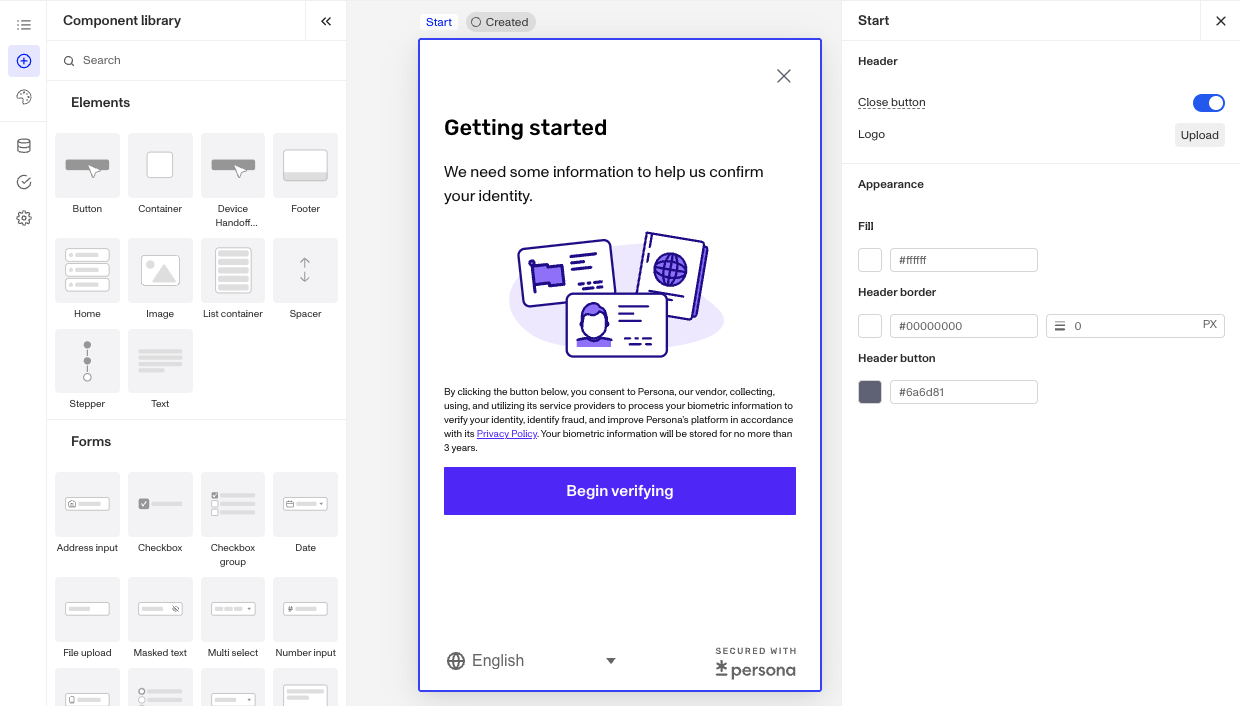
Components are the building blocks of designing your flow inside the Flow Editor. You can drag and drop components from the Component Library to arrange them on screens inside the Screen Editing View.
Using Component Design, Data, and Logic tabs
For most components, you will see tabs for Design, Data, and Logic. The elements groups of components do not interact with data and thus do not include that tab.
Design Tab
The Design tab lets you set sizing, spacing, and other attributes for each component.
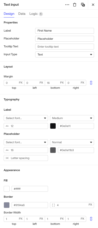
Depending on the particular component, some Design sections or even a particular configuration may be included or removed.
Design Tab Sections
| Section | What it controls | Components that use it |
|---|---|---|
| Properties | The core content and behavior settings like text content, labels, placeholder text, button type, URL, image source, step transitions, field options, and other component-specific configuration. | Most components (buttons, inputs, containers, text, image, stepper, home, etc.) |
| Appearance | Visual styling like fill/background color, border color and style, stroke, and highlight colors. | Buttons, inputs, containers, images, footer, repeatable container |
| Layout | Sizing and spacing: width, height, padding, margin, alignment, axis/direction, justify, flex width, and gap. | Nearly all components |
| Typography | Text styling per sub-element: font family, font size, font weight, line height, and color. | Buttons, all input types, text, title, privacy policy |
| Icons | Icon configuration for individual stepper states: current step, completed step, incomplete step, disabled step, errored step, and connector. | Stepper only |
| Default Icons | Default icon images for the home screen's initial and completed states. | Home only |
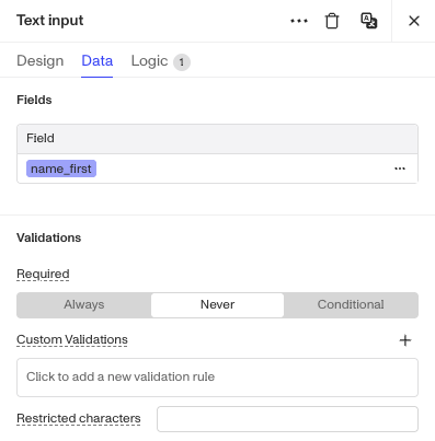
Data Tab
The Data tab is used for Form components to designate how to structure information collected from your end-users. You can also set validation rules for what information is allowed within a field. Depending on the particular component, some Data sections or even a particular configuration may be included or removed.
Data Tab sections
| Section | What it controls | Components that use it |
|---|---|---|
| Fields | Maps component inputs to inquiry fields. Component-specific options like field option-to-label mappings, number precision, country language prioritization, and location-based prefill behavior. | Nearly all Forms and Advanced forms inputs (text, select, checkbox, date, phone, address, etc.) |
| Validations | Rules enforced on the field value: required/optional, custom validation logic, date range constraints, restricted characters, strict URL format, file type allowlist, file size limit, and file upload count limit. | Most input types (text, select, checkbox, date, phone, address, file upload, etc.) |
| Autocomplete | Address autocomplete settings: enable/disable autocomplete, address type, manual entry prompt text, selected country code override, and subdivision handling. | Address input only |
| Format | Output format settings for the field value: specifically timezone handling for date values. | Date input only |
| Prefill | Controls whether the field can be pre-populated with a value passed into the inquiry. | Masked text input only |
| Form settings | Advanced settings specific to the International Database Inputs component: allowed ID types, entity type, hiding the country/ID-type selectors when prefilled or when only a single option is available. | International database inputs only |
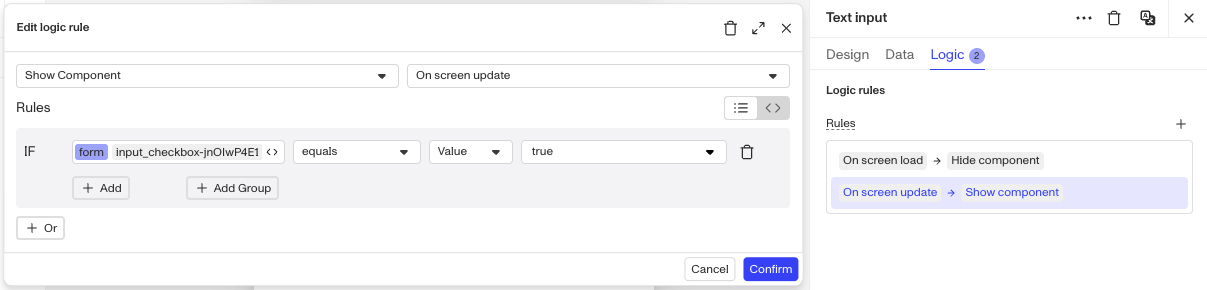
Logic Tab
The Logic tab lets you set behaviors for your components. You can build logic to Show, Hide, Disable, and Enable that component.
Component Options
There are many types of components. Note that we continue to add components, and this may be an incomplete list.
Elements
As noted earlier the Elements component groups do not include any Data configurations since they do not include any form inputs for end users.
| Component | Description |
|---|---|
| Button | A submit-action button that advances the user through the inquiry flow. |
| Container | A horizontal layout container for grouping and arranging child components side by side. |
| Device Handoff Button | A button that transfers the active inquiry session from one device to another (e.g., desktop to mobile). |
| Footer | A fixed footer area at the bottom of a screen, typically holding the primary action button. |
| Home | A pre-built home/start screen component for the initial inquiry landing experience. |
| Image | An image display component for adding hosted or locally uploaded visuals to a screen. |
| List Container | A list display component, with optional filtering to show only matching items. |
| Spacer | An invisible block used to add controlled whitespace between components. |
| Stepper | A visual step-progress indicator showing the user's position in a multi-step inquiry flow. |
| Text | A free-form text block for displaying body copy, instructions, or descriptions. |
Forms
| Component | Description |
|---|---|
| Address input | A structured input for collecting a full mailing address (street, city, state, ZIP). |
| Checkbox | A single checkbox for binary consent or agreement capture. |
| Checkbox group | A grouped set of checkboxes for collecting one or more selections from a list. |
| Date | A date picker input for collecting a calendar date from the user. |
| File upload | An input that allows the user to upload a file or document. |
| Masked text | A text input that obscures characters as they are typed (e.g., for SSNs or passwords). |
| Multi select | A dropdown or picker that allows the user to choose multiple values from a list. |
| Number input | A numeric-only input field for collecting integers or decimal values. |
| Phone number | A phone number input field with formatting and country-code support. |
| Radio group | A set of mutually exclusive radio buttons for selecting exactly one option from a list. |
| Select | A single-value dropdown picker for choosing one option from a list. |
| Text area | A multi-line text input for collecting longer free-form responses. |
| Text input | A standard single-line text field for collecting short free-form text. |
| URL input | A text input validated for URL format, for collecting web addresses. |
Advanced forms
| Component | Description |
|---|---|
| Country multi select | A specialized picker that allows the user to select multiple countries. |
| Country select | A specialized single-country picker pre-populated with a standardized country list. |
| Government ID Type Select | A dropdown for selecting the category of government-issued ID being submitted. |
| International database inputs | A set of inputs tailored to collecting identification data required for international database lookups. |
| MX Bank | An input specialized for Mexican bank account data collection. |