 Persona Help Center
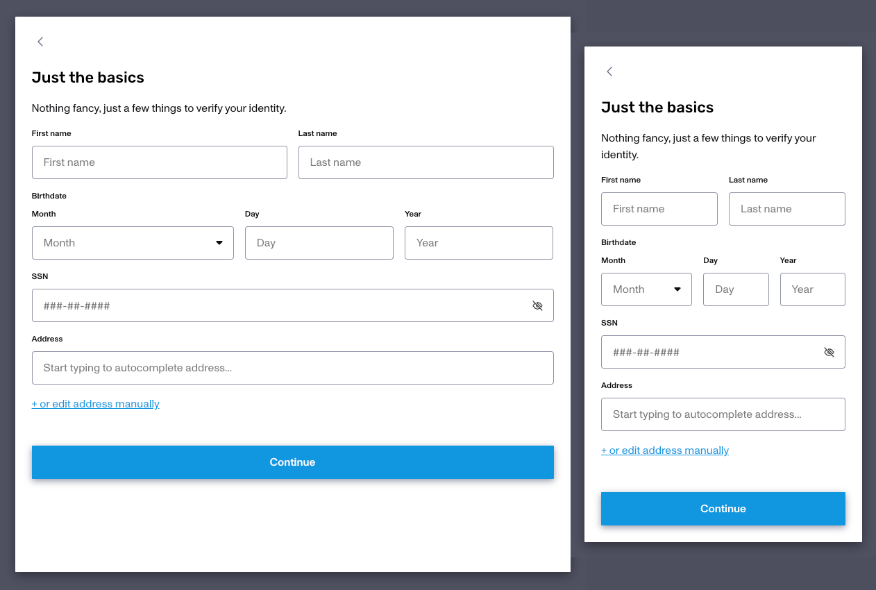
The default experience for end users on an Inquiry is expected to be via a phone, and thus with a smaller display size and UI design. But some KYB end users will prefer to complete the inquiry flow on a larger screen, instead of a phone, so they can input more data. Doing so with screen UI intended for phones is less than ideal, which is why Persona now supports desktop scale layouts for Inquiry flows. Below you can see the same inquiry with a wider horizontal max and vertical minimum display size intended for a desktop vs a default display size intended for phones.
Configure Desktop Dimensions
Common Setting Dimensions
| Common Device | Screen Width × Height |
|---|---|
| iPad Pro (portrait) | 834 × 1194 |
| iPad Pro (landscape) | 1194 × 834 |
| 13" Laptop | 1280 × 800 |
| 15" Laptop (standard) | 1440 × 900 |
| Monitor & larger screens | 1920 × 1080 & beyond |
Start with the dimensions below for a standard laptop view — and adjust based on your layout and expected user behavior:
| Min Width | Max Width | Min Height | Max Height |
|---|---|---|---|
| 800px | 1000px | 650px | 700px |
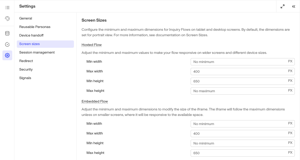
Screen size configs live in Settings > Screen Sizes. By default, dimensions are optimized for a portrait view.
Previewing Dimensions
The preview your updated dimensions you can:
- Hosted Flow: use Preview > Simulate OR create a test Inquiry
- Embedded Flow: use Preview > Simulate to preview specific Inquiry template/version
Expected Behaviors
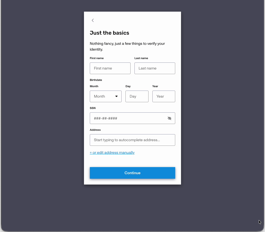
When screen size reaches or exceeds the mobile fallback breakpoint, ie. the default phone screen size, the layout automatically adjusts to fit the screen and the gray background goes away. Below we have two hosted inquiries, one will the default display limits vs the same inquiry with a 800x800 display size.
Breakpoints
- Hosted flow breakpoint: screen width < 769px OR screen height < 568px
- Embedded flow breakpoint: screen width < 600px OR screen height < 600px