 Persona Help Center
Overview
You can use the Flow Editor to create, design, and edit screens inside your Inquiry Flow.
In this tutorial, you'll learn how to:
- Add screens: Create new screens
- Use components: Drag and drop components to design your flow.
- Style components: Set the relevant style for a component like padding, font size, and color.
- Change component properties: Set the text of a component and the translations
Add a screen
- Open the Flow Editor for your desired Inquiry Template.

- Click any of the nodes in between screens and you'll then see options to add Screens, Modules, or other actions to your flow in this particular spot. Add a new screen
Adding and using components
Add a set of components for your screen to match your intended design.
- Select the Pencil icon beneath each screen to edit the screen.

- Select a component from the Component Library and drag and drop it on your screen. More details about available components can be found here.

-
Drag additional components like a text box or button onto your screen and arrange in your desired hierarchy.
-
Click Save
Deleting a Component

- Select the component.
- At the top of the right panel, click the trash icon.
Customizing Components
Theme first
At the inquiry template level you can configure the look, the style, the colors, of the inquiry via the Theme. Relevant to this mini tutorial on styling a button component, the Theme support configuring a Primary and Secondary style to buttons. Those setting can be updated in the Theme section of the left panel.

In this tutorial, we'll change the look of a button component. You can style and edit properties for any component.

-
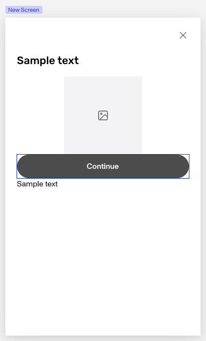
Open the screen editor for a screen with a button component and select the button.
-
Select the Design tab in the right panel.
-
Under Layout, add your desired Height or Width in PX.
-
Also under Layout, adjust the Margins around the component as well as Padding. Use the Lock icon to fix the inputs.
-
Under Typography, select the font family and other typography attributes,
-
Under Appearance, pick the Fill and Border color you want for the button. (If you don't want to choose, copy/paste this hex code for a dark gray:
#585656)-
To round the corners of your button, you can increase the border radius.
-
-
Click Save.

Screen Components
The Screen Editor supports a variety of components to help you tailor your customer facing experience. To learn more about them, click here.
(Optional) Publish
Your end users will not see your changes until you publish them.
Since this is a tutorial, you may not want your end users to see your changes! If and when you do want to deploy changes to your end users, hit Publish at the top right of the window.