 Persona Help Center
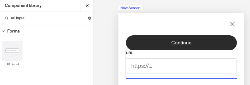
What is the Inquiry URL Input component?
URL Input is an Inquiry screen component that adds a specialized text field to the screen. It is designed for users to enter or edit web addresses (URLs). You can set how the input data is updated to the fields table and define logic that governs when it appears.
An URL Input component is useful when users need to provide a web address. Here are some common uses:
- Adding a link to a profile or bio
- Submitting a website link
- Embedding a resource like an image or video
How do you add an Inquiry URL Input component?
- Navigate to the Dashboard, and click on Inquiries > Templates.
- Find and click on the Inquiry template you want to edit, or Create a new template.
- Hover over a screen and click the Pencil icon, or double-click the screen to open it in the Screen Editing View.

- In the Left Panel, click Component Library and search for ‘URL Input’.
- Drag and drop the URL Input component into your screen, and reposition it by dragging it around.
- Click on the URL Input component, and go to Properties in the Right Panel.
- (Optional) Under Settings, you can customize Validations. The URL Input component includes built-in validations that check for proper URL formatting (such as ensuring URLs begin with “http://”). When users enter an invalid URL format, they receive an error message. If you need to add further validations you can learn more about Validations below.
- (Optional) Add a customized label, placeholder and translations:
- Edit the Label box to edit the title that will display above the URL Input box.
- Edit the text in the Placeholder box. The Placeholder displays temporary text inside the URL Input component, such as “https://withpersona.com” offering an example or guidance on the expected format until the user enters their own input.
- Add translations for the text by clicking Edit translations. You can Translate All or Translate individual languages, manually or automatically. If you don’t set translations, you’ll be prompted to do so upon Publishing the template.
- In the Fields tab, you can set up and customize the behavior of the URL Input component.
- Required: Choose whether the field is mandatory (Yes), optional (No), or based on conditions (Conditional). If you choose Conditional you will need to set a Logic rule; you can read more about Logic below.
- (Optional) Max length (char): This sets the maximum length of characters accepted for this input field. The default value is 1024 characters.
- (Optional) In the Logic tab, you can add rules that govern when the component appears, and when it does not. You can read more about Logic below.
- Close the step. You’ll have to Save and Publish the template to begin using it.
Validations
Validation rules can be set on a URL Input component to ensure that the entered data is a properly formatted and is a valid web address. This can prevent errors such as broken links or invalid inputs, and can ensure only usable and accurate URLs are submitted.
The Error message can be edited to provide the user with more information on why the URL Input is not valid. Translations for the error message can be added by clicking Edit translations. You can Translate All or Translate individual languages, manually or automatically. If you don’t set translations, you’ll be prompted to do so upon Publishing the template.

Validation Rules
Validation rules consist of three main components:
- Field: The object that will have a condition linked to it.
- Condition: How the field is compared to the value (e.g., equals, does not equal).
- Value: The value to test against.
Creating Validation Rules
- AND Statements: Combine multiple conditions that must all be true for the rule to pass. Add these using the "Add" button.
- OR Groups: Combine conditions where only one needs to be true for the rule to pass. Create these by clicking "Add OR Group".
How to use Validation Rules
- Click on the URL Input component, and go to Logic in the Right Panel.
- Create a validation rule by filling in the three boxes following When, which correspond to an object, its condition, and its value being assessed, respectively. When that validation rule passes, the component update is applied.
- (Optional) Add additional validation rules by clicking either + Add (if you want to add 'AND' rules, where all must be passed to continue) or + Or (if you want to add 'OR' rules, where one must be passed to continue). You can also nest a group of OR statements within an AND statement by clicking + Add Group.
- (Optional) To edit the validation directly, you can open the code editor.
Translations
Persona can automatically translate new text into other languages in the component’s Properties tab. You can also customize the translation for any particular language.

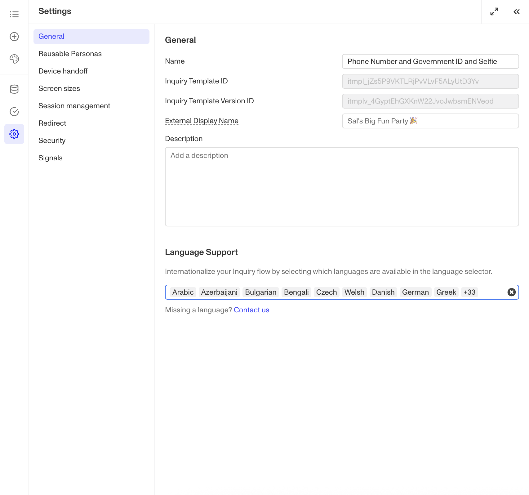
To configure available languages for your template, click the Gear icon in the Left Panel to access Settings, then select languages under the General tab.
Logic
Persona provides you with the ability to add logic to a URL Input component. For example, a component may only become visible to a user if certain conditions are met. On the Logic tab, there are two options for logic rules:
- On screen load: Logic rules are evaluated only when the screen loads. They can reference any field configured on the template.
- On screen update: Logic rules are evaluated in real time. They can only reference inputs on the current screen.

For form components a field can be labeled as required under specific conditions.
- Require field: Logic rules are evaluated in real time referencing inputs on the current screen. They can only reference inputs on the current screen.

Logic Rules
Logic rules consist of three main components:
- Field: The object that will have a condition linked to it.
- Condition: How the field is compared to the value (e.g., equals, does not equal).
- Value: The value to test against.
Creating Logic Rules
- AND Statements: Combine multiple conditions that must all be true for the rule to pass. Add these using the "Add" button.
- OR Groups: Combine conditions where only one needs to be true for the rule to pass. Create these by clicking "Add OR Group".
How to use Logic Rules
- Click on the URL Input component, and go to Logic in the Right Panel.
- Choose either “On screen load” or “On screen update” and click Add.
- Choose what Component Update to apply. This determines what happens to the component when the logical rules are met.
- Create a logical rule by filling in the three boxes following When, which correspond to an object, its condition, and its value being assessed, respectively. When that logical rule passes, the component update is applied.
- (Optional) Add additional logical rules by clicking either + Add (if you want to add 'AND' rules, where all must be passed to continue) or + Or (if you want to add 'OR' rules, where one must be passed to continue). You can also nest a group of OR statements within an AND statement by clicking + Add Group.
- (Optional) To edit the logic directly, you can open the code editor.
Plans Explained
URL Input component by plan
| Startup Program | Essential Plan | Growth Plan | Enterprise Plan | |
|---|---|---|---|---|
| URL Input component | Available | Available | Available | Available |
| Validations for URL Input component | Available | Available | Available | Available |
| Translations for URL Input component | Available | Available | Available | Available |
| Logic for URL Input component | Limited | Limited | Limited | Available |
Learn more about pricing and plans.