
This feature is currently in beta. Please reach out to your account team for access to dashboards.
A dashboard in Data Explorer is a page of charts, shared with everyone in your organization, built out of queries you have already written. Each chart on it is called a tile, and a tile is a pointer rather than a copy: it points at a chart that is saved on a query, and it re-runs that query to draw itself.
That is the part worth knowing before you start, because it decides the order of the work. You cannot build a chart on the dashboard. You build it on the query, save it there, and then place it. So creating a dashboard is two jobs in two places: first in the query editor, then in the Dashboards section.
Two different things are called a dashboard here. The Persona Dashboard is the site you sign in to. A dashboard in Data Explorer is one of these pages of charts. This article means the second one everywhere except in navigation paths.
Before you start
You need at least one saved query that has a saved chart on it. Neither half is optional. A query that returns results but has no chart cannot become a tile, and a chart you built but did not save goes away with the rest of your unsaved changes.
Building the query and its charts
-
In the Persona Dashboard, go to Data > Explorer.
-
Start a new query and give it a name. That name is what you will be scrolling for when you pick a tile later, so it is worth replacing Untitled Query with something you will recognise.
-
Write your SQL and click Run, or press Command + Return (Ctrl + Enter on Windows).
-
When the results table appears, click the + at the end of the tab strip above the results to add a chart. This button is disabled until a query has run successfully and come back with columns that can be plotted, which is why running the query is a step of its own rather than something you do at the end.
-
Set up the chart. Pick a Chart type (Area, Bar, Donut, Line, Pie, or Scatter), then fill in the axes it asks for, which vary by type: an X axis or Category, a Y axis or Value, and optionally Break down by to split one line into several, and an Aggregate of Sum, Average, Count, Min, or Max. Each chart gets its own tab, so you can add more than one to the same query.
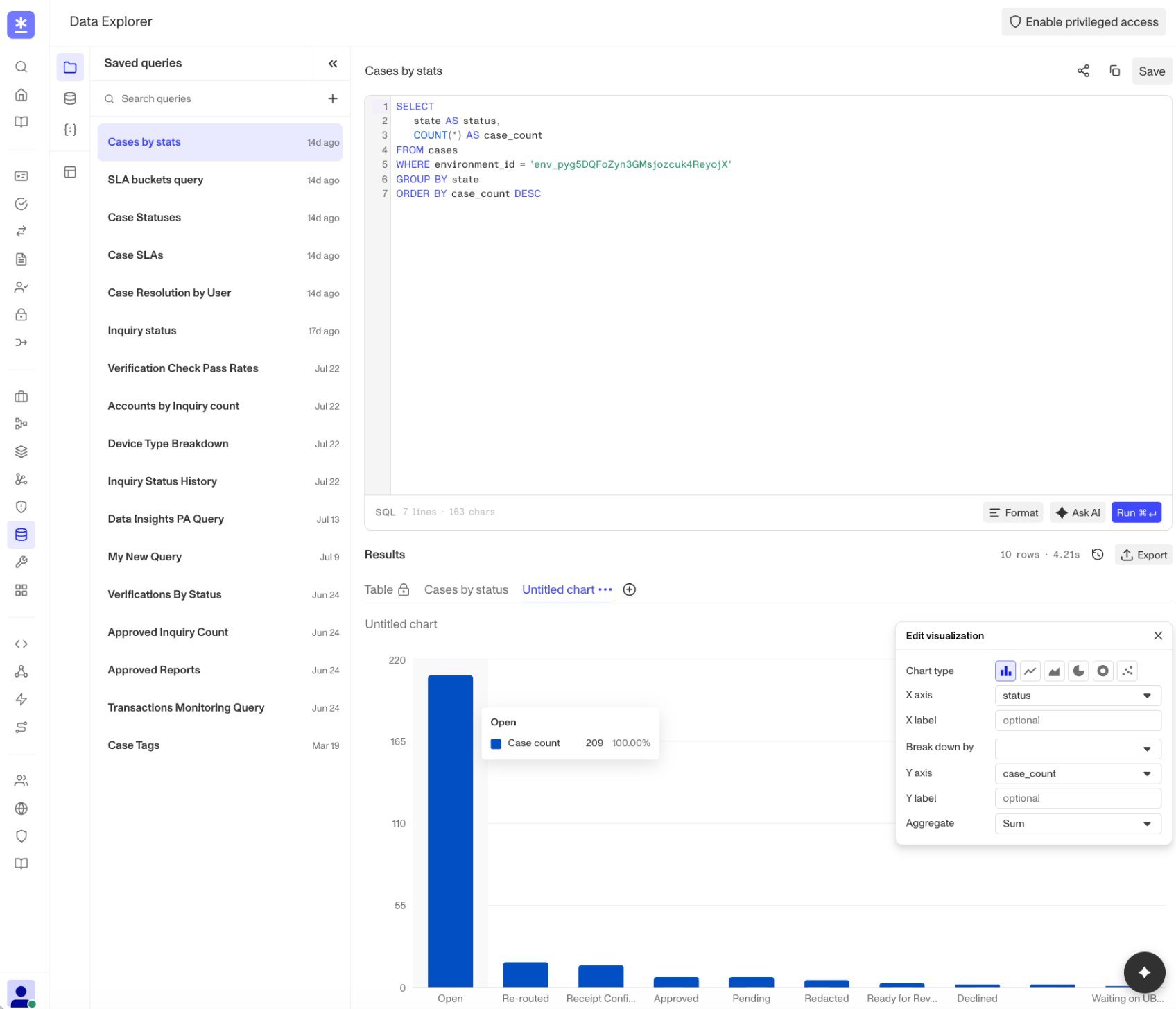
Configuring a bar chart for query results with the Edit visualization panel. -
Click Save.
Creating the dashboard
- In the left rail of Data Explorer, select Dashboards.
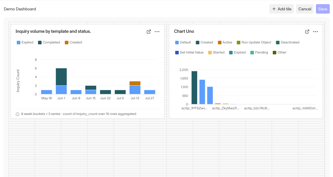
- Click New dashboard. This opens an empty draft. Nothing is stored yet, so a draft you abandon does not leave a stray dashboard behind for your colleagues.
- Replace Untitled dashboard with a name.
- Click Add tile. The dialog has two steps: pick a query, then pick one of that query’s charts. Only queries that already have a saved chart are listed, so a query missing from this list is usually one that never got step 6 above.
- Arrange the tile. Drag it to move it and drag a corner to resize it. The layout is a grid twelve columns wide, and tiles push each other out of the way instead of overlapping, so nothing you drop can cover something else up. Repeat from step 4 for each chart you want, up to 24 tiles on one dashboard.
- Click Save. While anything is unsaved an Unsaved changes marker sits next to the dashboard name, and saving is what clears it.
After you save
The dashboard is now visible to everyone in your organization, and everyone sees the same tiles. Editing is narrower than viewing: only the person who created a dashboard can change, rename, or delete it, so a colleague who wants a variation of yours makes their own rather than editing yours.
A few things worth knowing once it exists:
- Tiles are not live. The toolbar shows when the data was last pulled, and Refresh re-runs every tile on the page.
- Go to query on any tile opens the query behind it in Data Explorer. That is the fastest way to answer “what is this number actually counting”.
- In edit mode, each tile has Change source, which re-points it at a different query or chart, and Delete tile.
- Deleting a dashboard deletes it for everyone in your organization. The saved queries behind its tiles are not affected.
When a tile cannot draw
A tile that cannot run shows a message in place of the chart. Each one points at a different fix:
- This query failed. The SQL behind the tile errored when the dashboard ran it. Open it with Go to query and fix it there.
- Needs default values. The query uses variables that have no defaults, so the tile has no values to run with. Set defaults in the query editor and the tile can run on its own.
- Query no longer available. The query the tile points at is gone.
- Chart no longer matches the query. The SQL changed and the columns the chart was drawn from are no longer in the results. Rebuild the chart on the query and save it.
- Visualization removed. The chart was deleted from the query. Use Change source to point the tile at another one.