
Overview
Two of Persona’s layout modules — the Data Table and the Data Display — let you bring structured data into any case and account layout. While they present information differently, they share a common editing experience and configuration options:
- The Data Table renders information as rows and columns
- The Data Display renders labeled attributes in grids with sections
Both modules use the same set of features at the individual column or attribute level.
This article covers the features that work the same way in both modules, so you can learn the pattern once and apply it in either place.
How Each Module Is Organized
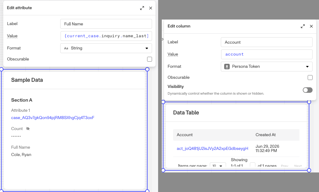
Before diving into the shared features, it’s helpful to understand how each module organizes its content.
Data Table
Columns represent vertical slices of the table. Each column has its own label, data source, and display configurations. You configure columns from a flat list in the module’s editor panel.
Data Display
Attributes are organized into sections. Each section can have its own title, subtitle, and layout settings. Within a section, each attribute displays as a single labeled field.
The shared features in this article apply to individual attributes and columns. Section-level settings (titles, layout) are separate from the per-attribute features described below.
Shared Features
Label
Every column (Data Table) and every attribute (Data Display) has a Label — the human-readable name shown to the reviewer above or beside the value.
- You can type a static label directly.
- You can also reference dynamic data to make the label context-aware (for example, pulling a name or status from the record itself).
- When you first select a data field as the value, Persona auto-derives a label from the field name. You can override it at any time and the override sticks even if you later change the value field.
Auto-labeling tracks the value field. As long as you haven’t customized the label, it will update automatically when you change which field the column or attribute points to.
Value - Data Source
The Value input controls what data is displayed. It points to a field, attribute, or metadata in the underlying object — typically via a data path like current_case.fields.risk_score
Both modules use the same Smart Input component. You can start typing a data path or data expression and Smart Input suggests matching fields based on the data connected to that module. You can learn more about using Persona’s Smart Input tool to build Data Paths here.
Display Format
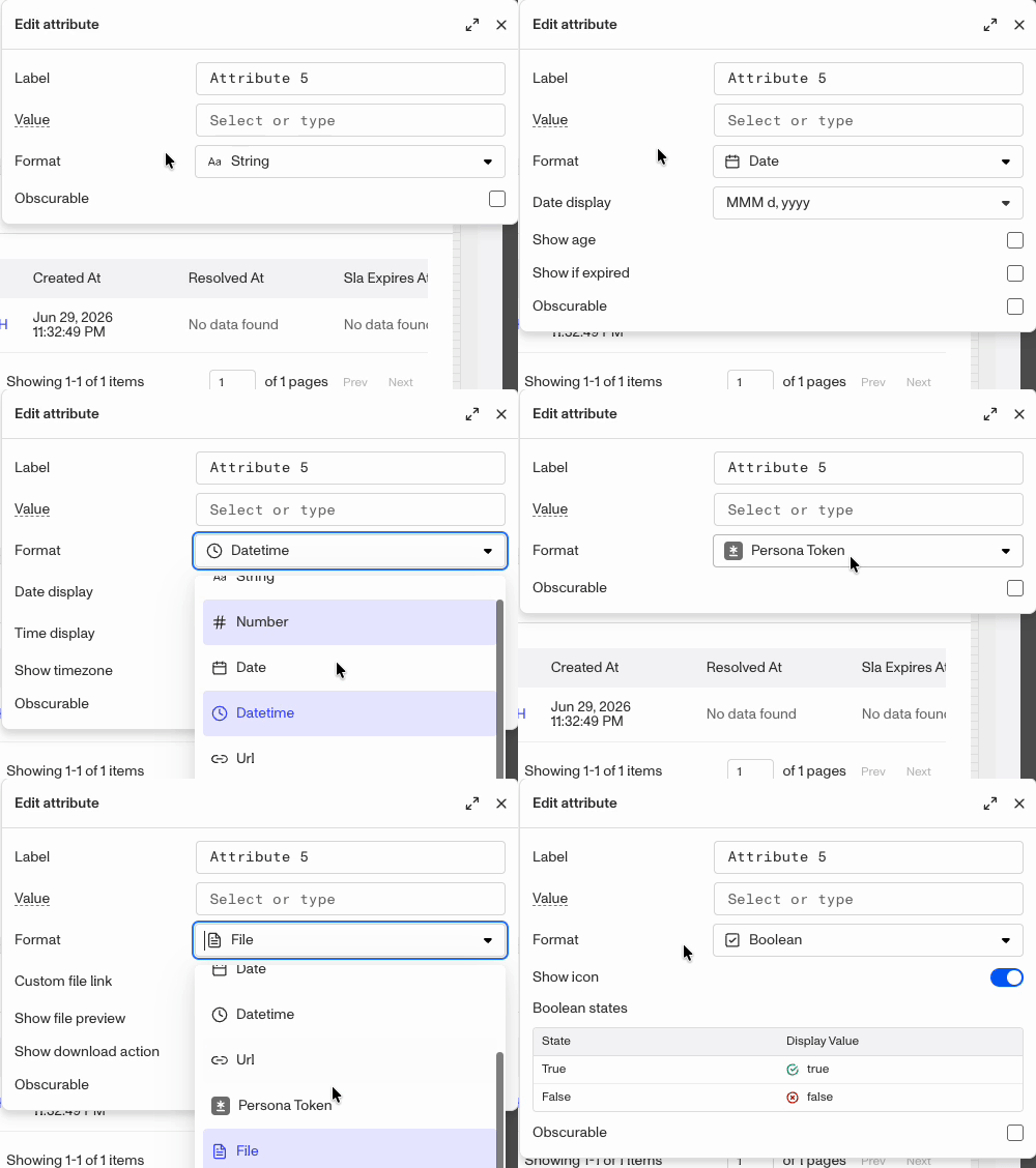
Once a value is selected, the Format setting controls how it is rendered to the reviewer. Both modules share the same format library:
| Format | Applicable data type | What it renders |
|---|---|---|
| String | String, Boolean, File | Plain text (default for most fields) |
| URL | String, File | A clickable hyperlink |
| Persona token | String | A Persona object reference (inquiry, case, account, etc.), rendered with its human-readable name + link |
| JSON | Hash | Shown in a JSON popover |
| Name | Hash | Map which object keys feed first / middle / last |
| Address | Hash | Map which keys feed street 1, street 2, city, subdivision, postal code, country code |
| Boolean | Boolean | Show icon on/off, custom true label, custom false label |
| Date | Date | A date value, with configurable display style and show age, flag if expired options |
| Datetime | Datetime | A date-and-time value, with configurable time display and timezone |
| File | File, Document, Government ID, Selfie | Custom file-link label, show thumbnail preview, show download action |
| Sticker | Choices, Multi-choices, status & tag references | Override default colors toggle, default color, and per-value mappings (value > label + color) |
| Number | Integer, Float | Numeric value, with optional notation (standard 1,500 / compact 1.5K), decimal places (0–10), pad trailing zeros configurations |
When you select a value, Persona automatically picks the most appropriate format based on the field’s type. You can always override it manually using the Format dropdown.
Format changes are non-destructive. Changing the display format on a column or attribute does not change the underlying data. It will only affect how it appears in the layout.
Obscurable
The Obscurable toggle marks a column or attribute as containing sensitive information that should be hidden by default and only revealed on demand.
When obscurable is enabled:
- The value is masked in the reviewer’s view (shown as
•••••). - A show/hide icon appears next to the column header (Data Table) or field label (Data Display).
- Reviewers can click the icon to reveal the value for their current session — other reviewers are not affected.
This is useful for fields like SSNs, bank account numbers, or other PII that most reviewers don’t need to see but that should still be accessible when required.
Conditional Visibility
Both columns (Data Table) and attributes (Data Display) support a Visibility rule — a condition that determines whether the column or attribute is shown at all on a given record.
Visibility rules can evaluate:
- The current record’s field values (e.g. show this column only when
status = "Escalated"). - The logged-in reviewer’s role (e.g. show this attribute only to Admins).
- Any other data available in the layout context.
When a visibility rule evaluates to false, the column or attribute is hidden entirely — it takes up no space and its label is not shown. This lets you build focused, role-appropriate layouts from a single template rather than maintaining separate templates for different teams.
The Basic rules builder is available on Cases Basic and above. Advanced (custom expression) controls require Cases Enhanced or Enterprise.
Obscurable and visibility are independent. You can use both together: hide a column entirely for most roles, and obscure it (show a masked value) for roles that do see it.
Data Display Only: Field Editing
The Data Display module has one additional per-section setting not available on Data Table columns: Enable field editing.
When a section has “Enable section field editing” turned on and then an individual attribute also has “Enable field editing” checked, reviewers can click directly on that attribute’s value in the case view and update it without leaving the case. This is useful for fields a reviewer might need to correct or supplement during their decision process — for example, filling in a verified document number or adding a note to a custom field.
Field editing is only available for fields with compatible data types (text, numbers, and single-select values). Complex types like objects, arrays, or files are view-only even when the toggle is checked.
Plans Explained
Accounts Data Table module columns and data display attributes by plan
| Startup Program | Essential Plan | Growth Plan | Enterprise Plan | |
|---|---|---|---|---|
| Accounts Data Table module columns and data display attributes | Limited | Limited | Available | Available |