
What is the Data Display Module?
The Data Display module is a flexible module that enables you to configure sections of data—such as attributes, fields, or metadata, including values pulled from related records—related to the current case or account as a clean, at-a-glance summary.
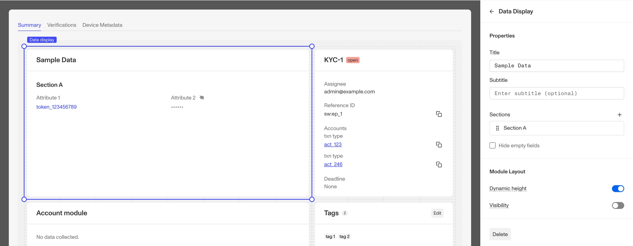
How do you add a Data Display module?
- Navigate to the Dashboard, and click on Cases > Templates.
- Find and click on the Case template you want to edit, or click Create template to make a new one.
- Navigate to the Tab where you want to add a module. Click an empty space to open the Component Library.
- In the right toolbar, search for ‘Data Display.’
- Drag and drop the Data Display module into your layout and reposition it by dragging it around.
- Click on the Data Display module on the right toolbar you can customize the Data Display module.
- Under Properties, you can customize the Title and add a subtitle to the module.
- Under Sections, you can add and remove Sections that will display on the Data Display module. Learn more about Section Configuration below.
- Under Layout, you can change:
- Dynamic height: Module will grow or shrink to fit its contents.
- Visibility: Dynamically control whether the module is hidden. This is a toggle button that lets you set conditions for when the button should be displayed or hidden from view based on your case requirements. You can read more about Visibility Configuration here.
- Click the Delete button to remove the component from the Case UI.
Section & Attribute Configuration
The Data Display module allows you to organize the the data with Attributes and Sections. Attributes are the individual pieces of data that you’re pulling to display and Section are the visual groups you place those attributes in. You configure these by Sections first and then by adding the Attributes to a Section.
Attribute Values vs Format
Attributes include four standard fields:
- Label is the editable name for the attribute.
- Value is the data the attribute is being pulled from.
- Format is the structure of the data.
- Obscurable is a toggle that hides the data content by default.
Data content that has been hidden via Obscurable can be revealed with a single click, and then hidden again with another click.
Attribute values support 19 value types (string, number, date, file, etc) and each type allows certain formats. If you select a value type, the format will be updated to show the available formats. You can also directly select a format, but it will not limit which value types you can select. Once a format is selected, additional related fields may be added or removed.
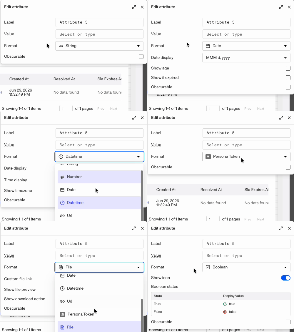
As demonstrated in the gif above, each format type adds or removes additional fields.
The 19 Attribute value types are:
- String
- Number
- Integer
- Boolean
- Date
- Datetime,
- Hash
- Array
- File
- Document
- Government ID
- Selfie
- Choices
- Multi-choices
- Ref – Status
- Ref – Tag
- Ref – Report status
- Ref – Resource
- Ref – Template
Attribute formats
The 11 supported Attribute formats are:
- String
- Number
- Date
- Datetime
- Image
- File
- Sticker
- Boolean
- URL
- Persona token
- Report status
Adding a Section and Attribute
-
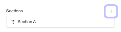
To add a Section, click the Add section button.
-
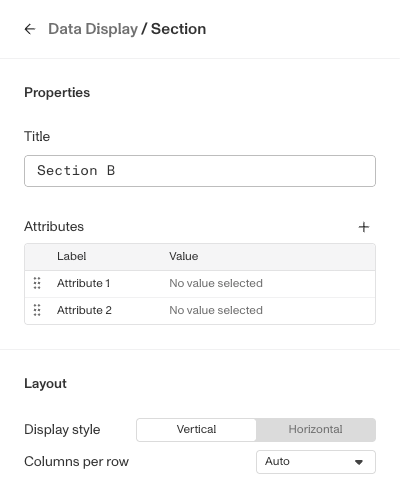
Use the title fields to update your section title.
-
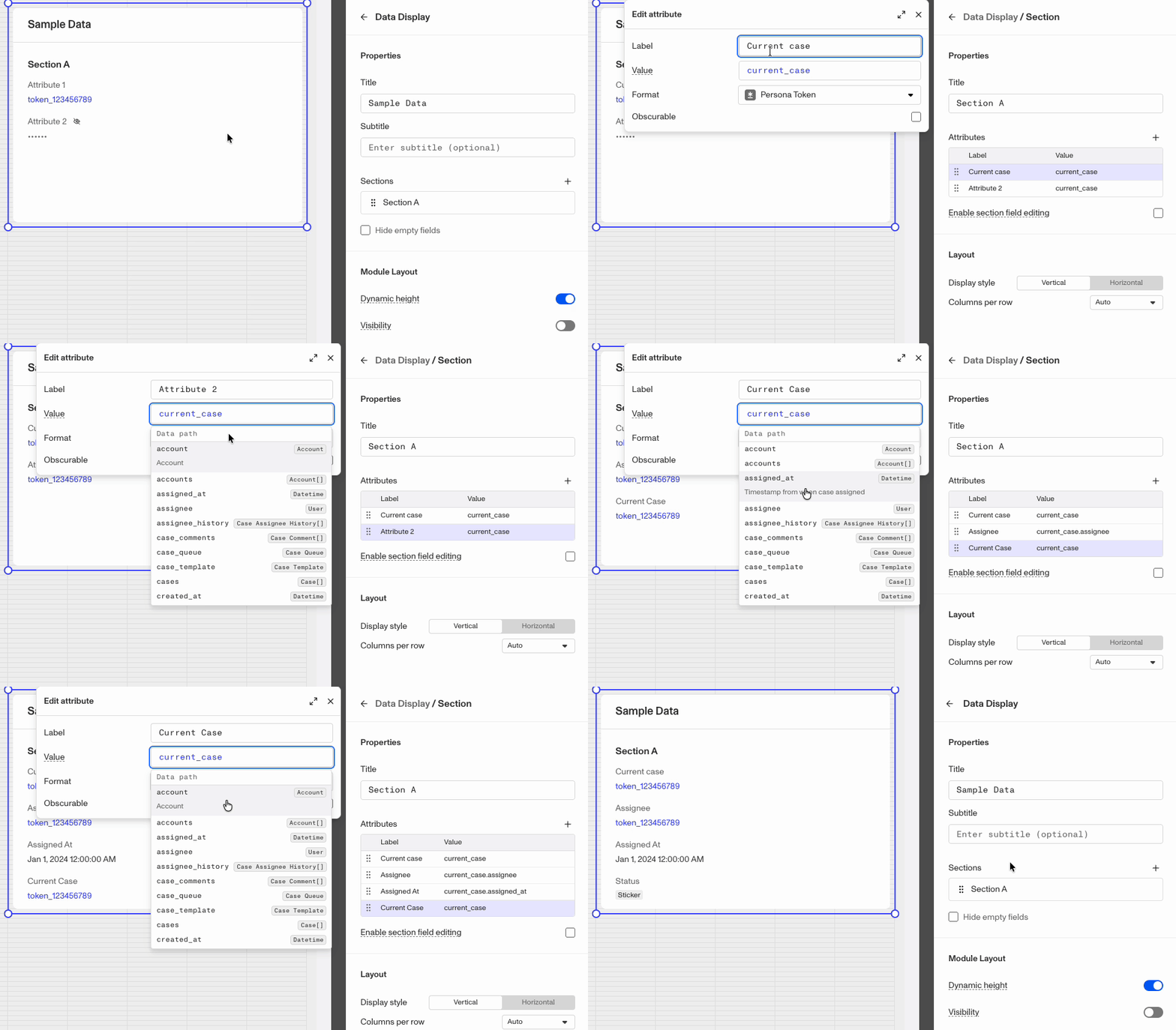
To add a new attribute, click the + button in the top right of the Attributes section.
-
To edit an attribute, click on its row.
-
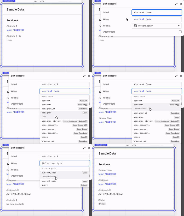
In the Value field, use the Smart Input tool to find the data you want the attribute to display.
-
The Attribute label will update with the name of the data selected, but you can customize if you require it.
-
Depending on the format, additional fields may be available for configuration.
-
In the Section Layout you can toggle between vertical or horizontal layout and set the columns per row.
-
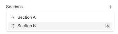
To remove a Section, mouse over the section and click the X icon on the right of the segment.
Preview with Case
If you wish to see how the module will display with actual data instead of simulated placeholder data, you can use the Preview with Case feature to use one of your existing cases as example data.
Steps
-
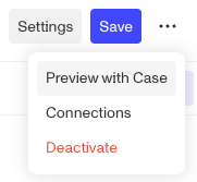
Go to the top right of the layout editior and click the 3 dot button.
-
From the dropdown, select “Preview with Case”.
-
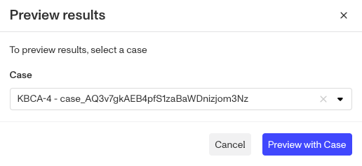
In the “Preview results” window, select the existing case from this template you’d like to use.
-
Click the “Preview with Case” button at the bottom right.
Data tied to the current Case
The current case has many other personal objects attached to it and you can use those connection to have the data table pull from those attached object. In the example below, a Data Path from a case to an attached inquiry, and then the accounts from that inquiry is used to focus on accounts from the inquiry. Then filters can be applied on top of the data narrow to scope of data included.
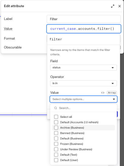
You can learn more about using Persona’ Smart Input tool to build Data Paths here.
Plans Explained
Data Display module component by plan
| Startup Program | Essential Plan | Growth Plan | Enterprise Plan | |
|---|---|---|---|---|
| Case Data Display module component | Limited | Limited | Available | Available |