
What is the Case Button component?
The Case Button is a Case component that can be added to a Case Template. Cases that are created from this Case Template provide reviewers with an an interactive element. When users click it, it can trigger a Case Action. You can also customize the component’s appearance, function, and define logic that governs when it appears.
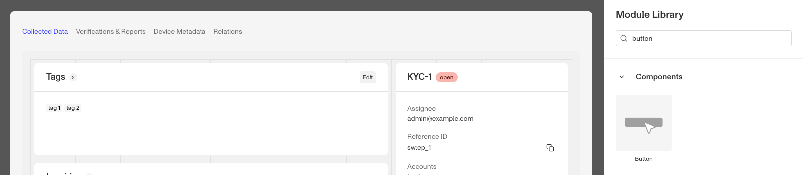
A Case Button is often used to trigger Case Actions such as editing multiple fields on the Case or creating additional Reports.
How do you add a Button component?
-
Navigate to the Dashboard, and click on Cases > Templates.
-
Find and click on the Case template you want to edit, or Create a new template.
-
Navigate to the Tab you want to add a Case component to. Click an empty space to view the Component Library.
-
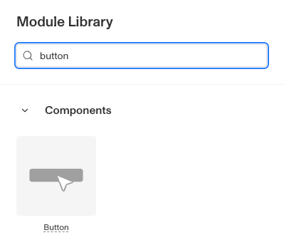
In the right toolbar, search for ‘Button.’
-
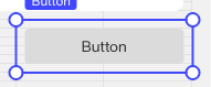
Drag and drop the Button component into your Case Layout and reposition it by dragging it around.
-
Click on the Button. On the right toolbar, you can customize the Button component:
-
Under Settings > Name, you can change the text displayed on the Button.
-
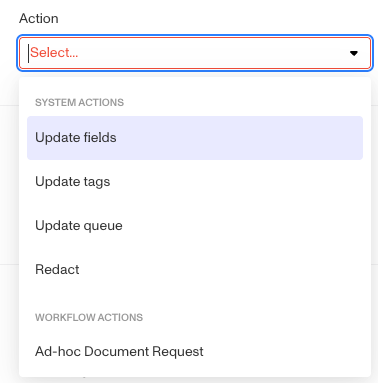
Under Settings > Action, you can change the action the Button completes when clicked.
-
Under Styling, you can set the Button color
- Default: The most common button style (Gray)
- Primary: To highlight important actions. (Blue)
- Critical: For actions that will delete data or be difficult to recover from. (Red)
-
Under Module Layout, you can change:
- Dynamic height toggle: Module will grow or shrink to fit its contents.
- Visibility: Dynamically control whether the module is hidden. This is a toggle button that lets you set conditions for when the button should be displayed or hidden from view based on your requirements. You can read more about Visibility Configuration here.
-
-
Click the “Delete” button if you want to remove the component from the Case Layout.
Plans Explained
Case Button component by plan
| Startup Program | Essential Plan | Growth Plan | Enterprise Plan | |
|---|---|---|---|---|
| Case Button component | Available | Available | Available | Available |