
What is the Inquiry Radio Group form component?
Radio Group is an Inquiry form component that adds a group of interactive components that allow a user to select an option from a predefined set, only a single option can be made.
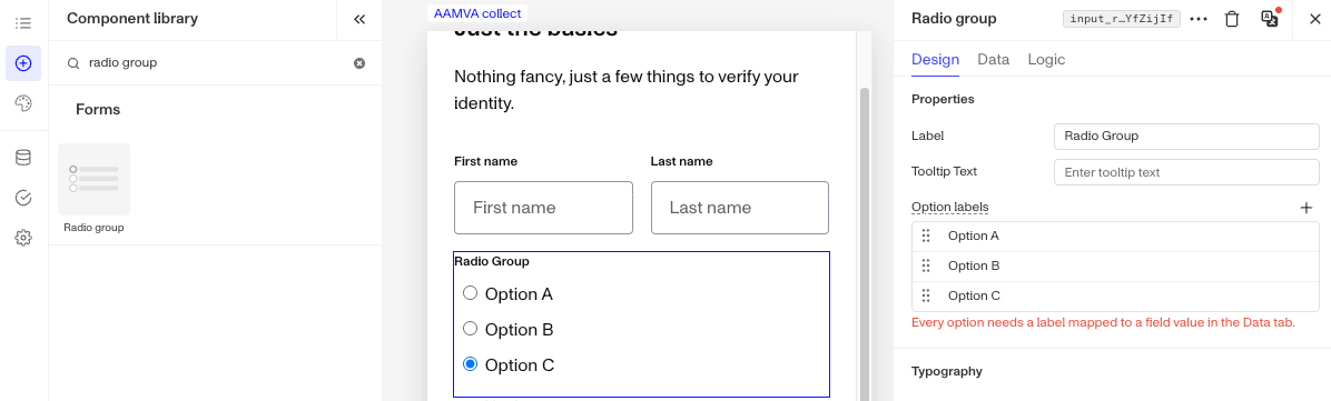
A Radio Group form component is ideal for scenarios like answering a multiple choice questions or selecting a preference.
How do you add an Inquiry Radio Group form component?
-
Navigate to the Dashboard, and click on Inquiries > Templates.
-
Find and click on the Inquiry template you want to edit, or Create a new template.
-
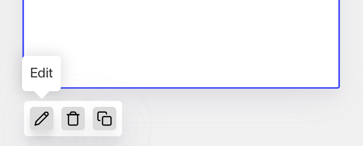
Hover over a screen and click the Pencil icon, or double-click the screen to open it in the Screen Editing View.
-
In the Left Panel, search the Component Library for ‘Radio Group’.
-
Drag and drop the Radio Group form component into your screen, and reposition it by dragging it around.
-
Click on the Radio Group form component to open its settings in the Right Panel. The panel has three tabs: Design, Data, and Logic.
- On the Design tab, under Properties:
- Label: Set the label shown above the options. The Label is a text element displayed above the Radio Group component to describe its purpose, such as “Business type,” helping users understand what information to provide.
- Tooltip Text: Set the tooltip text that gives users more context.
- Option labels: Set the display label for each option users can choose from. Click the + to add an option, click in the line to type its label, then press Enter to save it and start another (or click the + again). To edit an option, click it and change the text. Drag an option by its handle to change the order it appears in, or hover over an option and click the X to delete it. Each option also needs a value mapped to it on the Data tab.
- On the Design tab, use the Typography section to style the component. See the Design tab section on the Screen Step components in Inquiries page for details.
- On the Data tab, choose the field the input is written to, and map each option label to the value saved to that field. You can also customize the field’s behavior, such as whether it is required, and add custom validation rules to control when the entry is considered valid. See the Data tab section on the Screen Step components in Inquiries page for details.
- On the Logic tab, add rules that govern when the component appears, and when it does not. See the Logic tab section on the Screen Step components in Inquiries page for details.
- On the Design tab, under Properties:
-
Use the actions at the top right of the panel to copy, delete, or set translations on the component. To translate the text, see Editing translations for your Inquiry.
-
Close the step. You’ll have to Save and Publish the template to begin using it.
Plans Explained
Radio Group form component by plan
| Startup Program | Essential Plan | Growth Plan | Enterprise Plan | |
|---|---|---|---|---|
| Radio Group form component | Available | Available | Available | Available |