
What is the Inquiry Checkbox form component?
Checkbox is an Inquiry form component that adds an interactive component that allows a user to select or toggle an option on or off.
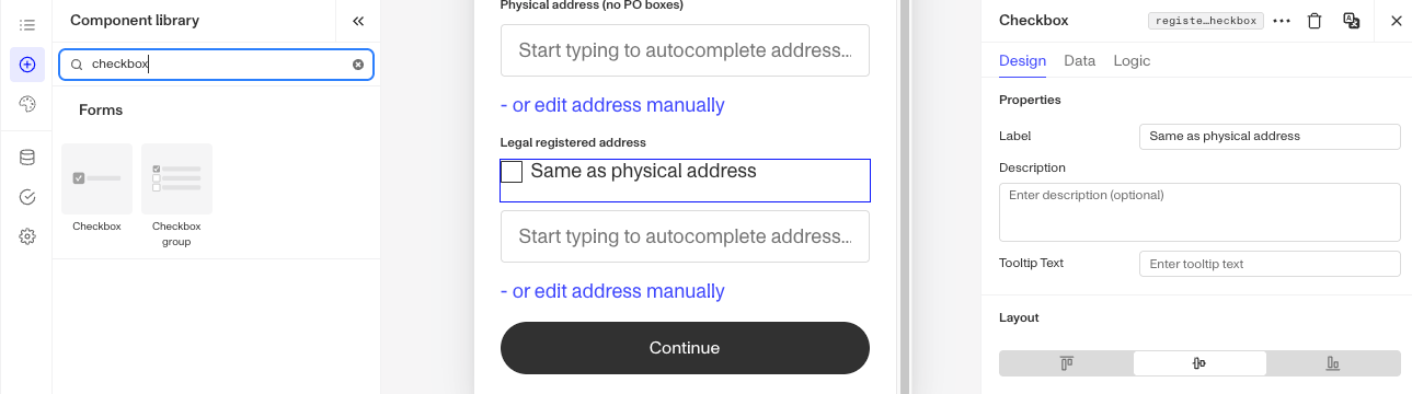
A Checkbox form component is ideal for scenarios like accepting Terms & Conditions, setting preferences, or allowing a user to make multiple selections.
How do you add an Inquiry Checkbox form component?
-
Navigate to the Dashboard, and click on Inquiries > Templates.
-
Find and click on the Inquiry template you want to edit, or Create a new template.
-
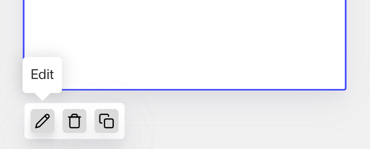
Hover over a screen and click the Pencil icon, or double-click the screen to open it in the Screen Editing View.
-
In the Left Panel, search the Component Library for ‘Checkbox’.
-
Drag and drop the Checkbox form component into your screen, and reposition it by dragging it around.
-
Click on the Checkbox form component to open its settings in the Right Panel. The panel has three tabs: Design, Data, and Logic.
- On the Design tab, under Properties:
- Label: Set the label shown next to the checkbox. The Label is a text element displayed next to the Checkbox component to describe its purpose, such as “Select Country,” helping users understand what information to provide.
- Description: Set the optional supporting text shown with the checkbox to give users more context. The Description Text displays text next to the Checkbox component, such as “Canada,” offering an example or additional context for the user.
- Tooltip Text: Set the tooltip text that gives users more context.
- On the Design tab, use the Layout and Typography sections to style the component. See the Design tab section on the Screen Step components in Inquiries page for details.
- On the Data tab, choose the field the input is written to. You can select a boolean field, or a datetime field to record the timestamp of when the user checked the box. You can also customize the field’s behavior, such as whether it is required, and add custom validation rules to control when the entry is considered valid. See the Data tab section on the Screen Step components in Inquiries page for details.
- On the Logic tab, add rules that govern when the component appears, and when it does not. See the Logic tab section on the Screen Step components in Inquiries page for details.
- On the Design tab, under Properties:
-
Use the actions at the top right of the panel to copy, delete, or set translations on the component. To translate the text, see Editing translations for your Inquiry.
-
Close the step. You’ll have to Save and Publish the template to begin using it.
Plans Explained
Checkbox form component by plan
| Startup Program | Essential Plan | Growth Plan | Enterprise Plan | |
|---|---|---|---|---|
| Checkbox form component | Available | Available | Available | Available |