
A custom code component is a screen component that you write yourself as a small React component. You add it to an inquiry screen in Flow Editor. It can show content, collect answers into inquiry fields, and send the user to a different screen.
Use a custom code component when the built-in components cannot give you the screen you need. For example, you can build a countdown button, a long terms document that the user must scroll to the end of, or a custom layout for data the inquiry already has.
Custom code components are included with Enhanced Templates.
Custom code components are in early access. To have them enabled for your organization, contact your Persona team.
How a custom code component works
A custom code component has two parts:
- Code. A React component that you write in Flow Editor. The code gets the values you configure and the current state of the inquiry.
- Configuration. A list of what the code uses:
- Properties are settings that the code reads, such as heading text, a color, or an inquiry field to show.
- Fields are inquiry fields that the component saves values to.
- Transitions are named exits that send the user to a screen or an action sequence.
After you define the configuration in the code editor, you set the values for each screen in the right panel. You can use the same code on more than one screen with different values.
A custom code component works like a built-in component:
- It counts toward the screen’s validation before the user can continue.
- It saves to real inquiry fields.
- It uses your template theme and translations.
- It supports Logic rules to hide, show, disable, or enable it.
Each time you save a change to the code, Persona keeps that version. A published template version always uses the exact code it was published with. When you change the code, live inquiries do not change until you publish a new template version.
Add a custom code component
-
In the Dashboard, open your inquiry template in Flow Editor.
-
Select the screen where you want the component.
-
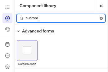
Open the component library. In the Advanced forms group, select Custom code.
-
In the right panel, click Edit Component Code. The Edit custom code editor opens.
-
Write your component code. The Preview panel shows the result when the code compiles.
-
Open the Configuration panel. Add the properties, fields, and transitions that your code uses.
-
Click Save. The code and configuration save to your draft template.
-
In the right panel, set the values for this screen:
- On the Design tab, set the property values and the layout.
- On the Data tab, map each field to an inquiry field and set validations.
- On the Logic tab, add hide, show, disable, or enable rules.
-
Connect each transition to a target screen or action sequence.
-
Publish the template version.
If you do not see Custom code in the component library or the Edit Component Code button, custom code components are not enabled for your organization. To have them enabled for your organization, contact your Persona team.
Configure properties, fields, and transitions
You define these in the Configuration panel of the code editor. Each entry has a Key. Your code uses the key to refer to the entry.
Design properties
Properties are settings that your code reads. Use a property when the component needs a value as an input but does not save it.
| Property type | Use it for |
|---|---|
| Text | Labels, headings, and body text. Text can be translatable or multiline. |
| Number | Numeric settings, such as a countdown length. |
| Boolean | On and off settings. |
| Choices | A fixed list of options. |
| Color | A color value. |
| Asset | An image or file. |
| Field | An inquiry field that the code reads. You can limit which field types are allowed. |
| Verification | A verification step in the template. |
If you change the type of a property, Persona clears its current value.
Data fields
Fields are inquiry fields that the component saves values to. The code can read and update each field by its key. For each field, you set the type and whether a value is Required. On each screen, you map the field to an inquiry field on the Data tab.
Transitions
Transitions are named exits that your code can trigger. Each transition goes to a screen or an action sequence. Each transition has one of two behaviors:
- Submit checks the validations and saves the form values. This is the default.
- Action skips validation and discards changes. Use it for exits such as Back or Cancel.
Write the component code
Your code can import only from these sources:
reactcomponents, the Persona component library
The component library includes these components: Button, Checkbox, Drawer, Icon, Image, Input, Label, Select, Stack, Text, Textarea, and Tooltip. Use them so that your component matches your theme.
Your component receives these values:
| Value | What it contains |
|---|---|
form | The fields you defined, with each field’s value, error, options, and required status. Use form.setValue(key, value) to save a value. |
properties | The values you set for each property on this screen. |
inquiry | The inquiry state: language and text direction, environment (sandbox or production), country code, the current screen name, and transition(key) to go to the next screen. |
theme | Your template theme values, such as the primary color and fonts. |
This example shows a heading from a property and a button that triggers a transition named continue:
import { Button, Stack, Text } from 'components';

export default function Welcome({ properties, inquiry }) {
  return (
    <Stack>
      <Text>{properties.heading}</Text>
      <Button onClick={() => inquiry.transition('continue')}>
        Continue
      </Button>
    </Stack>
  );
}
To debug your code, use the Errors and Logs tabs in the code editor. The Logs tab shows messages from console.log, console.warn, and console.error.
Fix common errors
Persona checks your component when you save and when you publish. A save can succeed and the publish can still fail, so fix all errors before you publish.
| Error | What to do |
|---|---|
| Custom code components are not enabled for this organization | To have them enabled for your organization, contact your Persona team. |
| Failed to compile | Fix the error on the line that the message names. Check that you import only from react and components. |
| Field … is used in the code but not declared | Add the field to Data fields in the Configuration panel. |
| Field … must be mapped to a field | On the Data tab, map the field to an inquiry field. |
| Field … does not reference a valid field | Map the field to an inquiry field that exists in the template. |
| Transition … must have a target | Connect the transition to a screen or action sequence. |
| Property … holds a value that is not valid | Set a value of the correct type, or change the property type. |
| Is only supported on UI screens | Move the component to a standard screen. |
| Source exceeds the size limit, nests too deeply, or is too complex | Make the code smaller or simpler. The limit is 1 MB. |
| Has no compiled build | Open the code editor and save the draft again. |
Limitations
- Load time. A component can take a short time to load. This happens because it runs in a separate, secure frame.
- Preview. The Flow Editor preview can be different from a live inquiry. Test your template in sandbox before you publish.
- Restricted data. For security, components cannot read one-time passcodes, session tokens, or handoff links. Components cannot run device credential steps, such as passkeys, NFC, or mobile driver’s licenses.
- No third-party scripts. Do not load external scripts in a component.
- Copying templates. To copy a template with a custom code component to a different organization, custom code components must be enabled in that organization too.
When to use a custom code component
Use a custom code component when:
- No built-in component or combination of components gives the result you need.
- You need custom behavior on one screen, such as timers, scroll checks, or custom layouts.
Do not use a custom code component when:
- A built-in component can do the job. Built-in components work in all SDK versions and load faster.
Plans Explained
Custom code components are included with Enhanced Templates. They are available on the same plans as Enhanced Templates. A template that uses Enhanced features is billed at the Enhanced template rate.
Custom code component by plan
| Startup Program | Essential Plan | Growth Plan | Enterprise Plan | |
|---|---|---|---|---|
| Custom code component | Not Available | Not Available | Available | Available |