
What is the Inquiry Image component?
An Image component is an Inquiry screen component that adds an image to the screen. You can customize its appearance and define logic that governs when it appears.
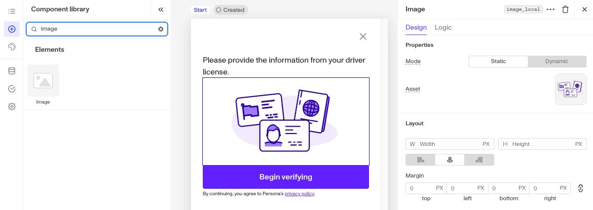
Adding an image to a screen is useful for enhancing visual appeal, supporting branding, or providing content. Examples include displaying a logo at the top of the screen or adding an illustration to guide users through a process. Images help capture attention and make the interface more engaging and informative.
How do you add an Inquiry Image component?
-
Navigate to the Dashboard, and click on Inquiries > Templates.
-
Find and click on the Inquiry template you want to edit, or Create a new template.
-
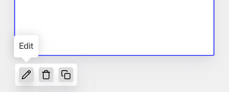
Hover over a screen and click the Pencil icon, or double-click the screen to open it in the Screen Editing View.
-
In the Left Panel, search the Component Library for ‘Image’.
-
Drag and drop the Image component into your screen, and reposition it by dragging it around.
-
Click on the Image component to open its settings in the Right Panel. The panel has two tabs: Design and Logic.
- On the Design tab, under Properties:
- Mode: Choose Static or Dynamic. Static uses an uploaded asset. Dynamic pulls the image from an Inquiry field at runtime.
- Dynamic: Under Use asset from, reference a file or array-of-file Inquiry field. The image is resolved at runtime from the value the Inquiry collects.
- Asset: Click Upload to add an image. Under My assets, click Add new to upload your own image, or select Persona assets to browse Persona’s image library.
- Alt text: Add alt text to describe the image. Alt text improves accessibility by describing the image for users who rely on screen readers, and provides context if the image fails to load. It ensures all users can understand the content and purpose of the image.
- Image fit: Choose Fit or Fill. Fit preserves the image’s aspect ratio. Fill stretches the image to the container width.
- Mode: Choose Static or Dynamic. Static uses an uploaded asset. Dynamic pulls the image from an Inquiry field at runtime.
- On the Design tab, use the Layout and Appearance sections to style the component. See the Design tab section on the Screen Step components in Inquiries page for details.
- On the Logic tab, add rules that govern when the component appears, and when it does not. See the Logic tab section on the Screen Step components in Inquiries page for details.
- On the Design tab, under Properties:
-
Use the actions at the top right of the panel to copy or delete the component.
-
Close the step. You’ll have to Save and Publish the template to begin using it.
Plans Explained
Image component by plan
| Startup Program | Essential Plan | Growth Plan | Enterprise Plan | |
|---|---|---|---|---|
| Image component | Available | Available | Available | Available |