What is the Inquiry Button component?
Button is an Inquiry screen component that provides an interactive element. When users click it, it triggers an action. You can customize its appearance, function, and define logic that governs when it appears.
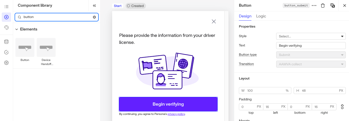
A Button guides users through key actions such as submitting forms, opening pages, or canceling operations. It is essential for enabling user interactions and directing workflows.
How do you add an Inquiry Button Component?
-
Navigate to the Dashboard, and click on Inquiries > Templates.
-
Find and click on the Inquiry template you want to edit, or Create a new template.
-
Hover over a screen and click the Pencil icon, or double-click the screen to open it in the Screen Editing View.
-
In the Left Panel, search the Component Library for ‘Button`.
-
Drag and drop the Button component into your screen, and reposition it by dragging it around.
-
Click on the Button component to open its settings in the Right Panel. The panel has two tabs: Design and Logic.
- On the Design tab, under Properties:
- Style: Choose the button style, primary or secondary. The appearance of each style is defined in the Theme section of the Left Panel, and can be overridden for this Button on the Design tab.
- Text: Set the text displayed on the button.
- Button type: Define what happens when users click the button. Choose from: Action, Cancel, Complete, Link, or Submit. See Button types below.
- Transition: Select screen or action sequence to transition to when this button is clicked. The transition target cannot be changed after the template has been saved.
- On the Design tab, use the Layout, Typography, and Appearance sections to style the component. See the Design tab section on the Screen Step components in Inquiries page for details.
- On the Logic tab, add rules that govern when the component appears, and when it does not. See the Logic tab section on the Screen Step components in Inquiries page for details.
- On the Design tab, under Properties:
-
Use the actions at the top right of the panel to copy, delete, or set translations on the component. To translate the text, see Editing translations for your Inquiry.
-
Close the step. You’ll have to Save and Publish the template to begin using it.
Button types
There are five Button types: Action, Cancel, Complete, Link, and Submit. Each has a different set of settings and use.
- Action type: Triggers a specific task or interaction. You must set a Transition that defines what happens when the button is clicked, either Screen and Action Sequence.
- Screen transition: Changes to a different screen when the button is clicked. Select the transition screen from the dropdown. You will see a list of available screens from your Inquiry.
- Action Sequence transition: Uses an action sequence to determine the next screen. Select the sequence from the dropdown. You must set an Error screen to choose where users are routed if the sequence fails. Select the error screen from the dropdown.
- Cancel type: When the user clicks this button, the flow ends immediately without completing the path.
- Complete type: When the user clicks this button, the flow ends and the current path is completed.
- Link type: Opens a URL when the user clicks the button, without submitting form values or advancing the Inquiry.
- Submit type: Triggers a specific task or interaction. You must set a Transition that defines what happens when the button is clicked, either Screen and Action Sequence.
- Screen transition: Changes to a different screen when the button is clicked. Select the transition screen from the dropdown. You will see a list of available screens from your Inquiry.
- Action Sequence transition: Uses an action sequence to determine the next screen. Select the sequence from the dropdown. You must set an Error screen to choose where users are routed if the sequence fails. Select the error screen from the dropdown.
Plans Explained
Button component by plan
| Startup Program | Essential Plan | Growth Plan | Enterprise Plan | |
|---|---|---|---|---|
| Button component | Available | Available | Available | Available |